openSUSE:Artwork guidelines
Inhoud
Bestemd voor
| Dit artikel is nog maar gedeeltelijk vertaald. Als u mee wilt helpen met vertalen lees dan Wiki vertalen naar het Nederlands. |
The target audience of the openSUSE distribution are the Linux developers, enthusiasts, and to those who are interested in having an up-to-date software. Some, however, prefer stable, supported, but perhaps a little outdated software. The style to aim for can be described with the following adjectives common for all releases:
- Fresh
- Vivid
- Dynamic
- Futuristic
- Natural
- Spacious
Layout
Always make use of whitespace. Cramming as much stuff as possible into the available space is something to avoid. Generally, separation of different elements or blocks is to be done with whitespace rather than lines or rules.
Make use of the golden ratio.
Colors
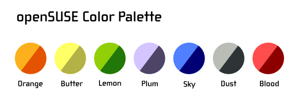
The openSUSE color palette only contains a very basic set of colors. You are not limited to using colors solely from this palette for your designs. It is however a good practice to start from these core colors and tweak the lightness of saturation to your liking rather than starting from arbitrary colors.
The color palette is also available for download at colorlovers.com in several palette-formats (e.g. PS, AI, etc.):
Note: colorlover.com supports currently only 5 colors per palette.
Wallpapers
The goal of the default wallpaper graphic is to be unobtrusive and allow the items on the desktop to be seen. It should not hinder the overview of user's desktop.
While a solid color background seems to be a perfect fit based on the goal above, the wallpaper also shouldn't be completely dull and boring.
It is very likely that a user will customize a wallpaper and even go against the outlined goal, putting a photo of his beloved one as the background. The default graphic however should only be some sort of abstract shape with low contrast of the texture. Abstract shapes work best for two reasons. First it doesn't make the human visual system focus on the background, but the items on top of it and also it avoids cultural or religious specifics. Using a picture of an animal might have such implications and in worst case scenario insult the user.
Icons
openSUSE is in a difficult position in that it ships a choice of two desktop environments by default -- KDE and GNOME. Each of them has historically evolved a unique style for its icons. The openSUSE user will however likely to run applications coming from both developer camps and projects completely unrelated (FIrefox, OpenOffice.org). The Tango project has been founded to address the need to create application icons that fit well into existing environments such as KDE and GNOME as well as other non-free platforms like MS Windows and Mac OS. GNOME is slowly adopting the Tango style guidelines for its artwork and shifting away from using a unique look for its icons. KDE is also undergoing an icon style overhaul and aims to follow the look defined in the Oxygen style guide. This considerably narrows the gap between the styles.
While the differences in style (color, perspective, shadows) are more pronounced at larger sizes, at toolbar and menu sizes the differences are relatively minor and allow to overcome the need to style every single application depending on what desktop environment the user is running. Applications such as GIMP or Scribus don't look out of place when ran under either GNOME or KDE anymore.
Desktop agnostic illustrations
There are styling elements in openSUSE that are common to whether the user chose GNOME or KDE during installation -- boot select (grub), boot screen (bootsplash), help template, etc. We suggest to either avoid using icon artwork there or use photo-realistic, large sized (64x64 px and above) illustrations, close to the Oxygen style.
Application icon contributions
Specific application icon contributions should happen upstream as much as possible. openSUSE does not aim to maintain its own application icon themes. Applications that don't come from either GNOME or KDE projects, especially when being multi-platform will benefit from the Tango styling. Please make yourself familiar with the Tango style guidelines.
Branding overview
Some Novell Brands (or "Marks" like trademarks, logos, service marks,...) are part of the styling in openSUSE distributions.
Novell restricts the use of its Marks. Please see the openSUSE license and Terms of site for possible obligations on your part. For your convenience we have a collection of tools (see Making an openSUSE based distribution, rembrand) to help you with such obligations.
Styling
Styling refers to custom artwork through which we define the visual coherence of the product. openSUSE is an ethusiast, community based distribution, which is reflected in the style.


